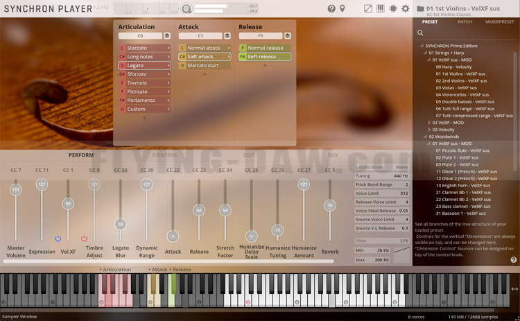
On September 3, VSL brought a new feature enhancement to Synchron Prime Edition - Flow View.
Flow View is a redesigned UI interface optimization (beautification) solution that provides a very intuitive user experience.
在 9 月 3 日,VSL 为 Synchron Prime Edition 带来了一项全新的功能增强 —— Flow View。
Flow View 是一项重新设计的 UI 界面优化(美化)方案,能够提供非常直观的使用体验。
Before the Flow View feature was deployed, the interface of Synchron Prime Edition was like this:
在 Flow View 功能部署之前,Synchron Prime Edition 的界面是这样的:

After the Flow View feature is deployed, the Synchron Prime Edition interface looks like this:
在 Flow View 功能部署之后,Synchron Prime Edition 的界面是这样的:

Not only that, there are new UI changes for switching skills and selecting instruments:
不仅仅如此,在切换技巧和选择乐器等方面,都有新的 UI 界面改变:

In VSL's official video, VSL also said that they really want to know how users feel about this Flow View update?
So, on behalf of the Chinese market, we are collecting your opinions here. You can vote below or reply to post more insights!
This is important because it will allow VSL to decide whether to deploy the Flow View interface to other products faster!
在 VSL 的官方视频中,VSL 也说了,他们很想知道用户对于这次的 Flow View 更新感觉如何?
所以,我们代表中国市场在此收集各位的看法,您可以在下面投票,也可以回帖做发表更多的见解!
这很重要,因为这会让他们决定是否更快的将 Flow View 这种界面部署到其它产品上!


